MessageMail - Landing Page Design
My Role
UI/UX Designer
Client
MessageMail
Tools
Figma
Industry
Tech
Service
Landing Page Design
Date
May 2025
Landing page design for a fictional social media platform that ties all your social media platforms together into one core inbox.
View the full project on Behance: https://www.behance.net/gallery/226851581/MessageMail-Landing-Page-Design
Brief
MessageMail is a fictional social media platform that unifies all your inboxes into one place — Twitter DMs, LinkedIn messages, Instagram chats, and more.
The challenge was to design a playful and approachable landing page and signup flow that clearly explains the product, works across all major screen sizes, and encourages users to create an account.
The client wanted:
A friendly, fun tone (avoid anything too serious or corporate)
Use of the font Nunito
Flexible color direction (open to any palette)
A working prototype for both pages across desktop, tablet, and mobile
Process
1. Discovery & Audience Research
I began by analyzing similar products and playful SaaS brands (e.g. Slack, Notion, Hey). Bright colors, rounded typography, and illustration-led storytelling were common — perfect for a product like MessageMail that wants to feel social and friendly.
2. Wireframes & Layout Planning
I mapped out wireframes for both the landing page and the sign-up page with clear goals:
Communicate the product’s core idea fast
Guide users through features with visual interest
Build trust through social proof
Encourage action with clear, accessible CTAs
3. Design System & Color Exploration
I tested a variety of palettes before landing on a light, soft color scheme that matched the product’s tone. I then built a simple design system with:
Primary + secondary colors
Heading/body type rules using Nunito
Card/button styles
CTA hierarchy
Design Decisions
Hero Section
Two-column layout featuring:
Custom illustration to build tone
Clear headline with strong value prop
Supportive subline and primary CTA

Features Section
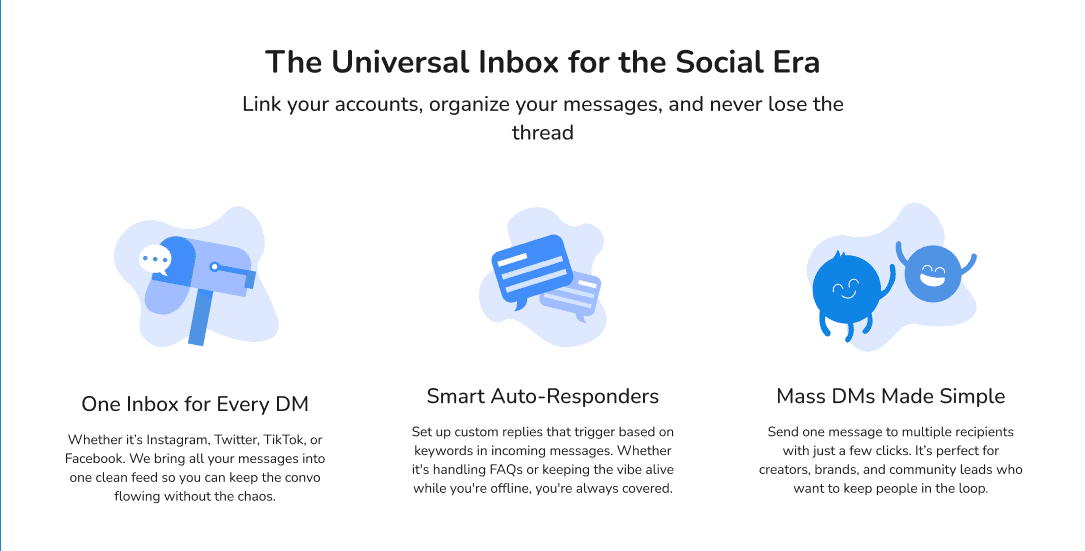
Used a 3-column grid with playful illustrations to showcase core features (Multiple Inbox Integration, Smart Auto Responders, and Mass DM'ing) in a way that’s scannable and visually inviting.
Testimonials
Instead of brand logos or company quotes, I used fictional user reviews styled like social media comments, reinforcing the idea that this is built for people, not corporations.

Final CTA
Finally I wanted to add yet another CTA at the end of the landing page, in an attempt to convert users who are interested, but needed to learn more first:

Signup Page
Kept it clean and minimal. One column with light illustrations, short form fields, and friendly language to reduce signup friction. Also included validation states and microcopy for clarity.

Mobile & Tablet
Adapted both pages for tablet and mobile views:
Collapsed nav menu into burger menu, keeping main CTA button
Reflowed features section into vertical stack
Adjusted typography and spacing for readability
Simplified the testimonial section for smaller screens
Created stacked Footer design
Final Design

The final deliverables included
Landing page (Desktop, Tablet, Mobile)
Signup page
Interactive prototype in Figma
Reusable components and design system
Reflection
I learned a lot, including:
How to tailor content and visuals to match a target audience's tone and expectations
The importance of clear UX structure when adapting between screen sizes
How micro-interactions, voice, and layout combine to guide users toward conversion
How to use illustration and whitespace to balance personality and usability
Continued to hone my design skills when it comes to landing design, and how to effectively communicate the idea of a product to the end user in a way that maximizes conversions.

